
Dubai has firmly established itself as a global powerhouse for finance. At the heart of this boom is the Dubai International Financial Centre (DIFC), a massive hub where global banks, wealth management firms, and innovative financial technology (fintech) startups operate. These companies deal with the most sensitive things in a person’s life: their money, their investments, and their private data. However, when a new financial company hires a Website developer Dubai to launch their platform, they often receive a website that looks exactly like a standard software or e-commerce page. It might have colorful graphics, bouncy animations, and short, punchy marketing text. For a fintech company, this approach is a disaster.
When you ask a user to connect their bank account, deposit their savings, or trust you with their retirement fund, their brain completely changes how it evaluates your website. They are no longer looking for a fun or entertaining experience. They are looking for absolute, bulletproof safety. If your website feels cheap, rushed, or overly playful, the user will instinctively close the page, no matter how good your financial product is.
To succeed in Dubai’s highly regulated financial ecosystem, your website must be built around a concept called “Security-First UX.” This means that every single design choice, from the colors to the layout to the way a button clicks, must be designed to build deep, psychological trust. In this blog, we will explore exactly how to design a website that proves to your users that their money is safe with you.
The Psychology of Financial Trust Online
Before we look at design tactics, we need to understand how human beings think about money on the internet. In the physical world, banks build massive buildings with heavy stone pillars, thick glass, and security guards. These physical elements tell our brains, “This place is strong; my money is safe here.”
In the digital world, you do not have stone pillars or security guards. You only have pixels on a screen. Therefore, your digital user experience (UX) has to replace that physical security. If a user feels confused by your navigation, if a page loads too slowly, or if a link is broken, they will immediately wonder, “If they cannot even build a working website, how can they protect my money?” Every single interaction on a fintech website is a test of your competence.

Here is how you can pass that test by implementing security-first design principles.
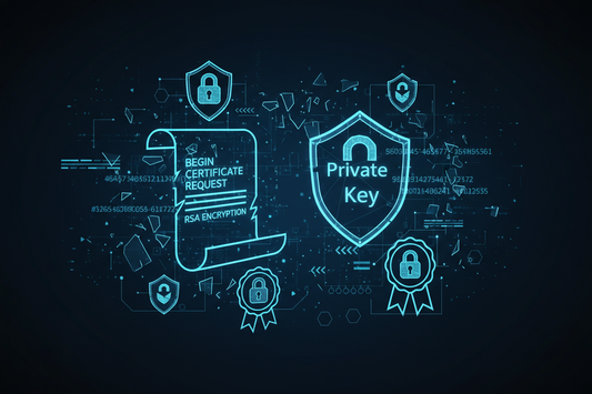
1. Visualizing Security: Trust Badges and Encryption Signals
People cannot physically see the complex code that protects your website. You have to translate that invisible backend security into visual signals that regular users can instantly understand and appreciate.
Strategic Placement of Trust Badges: Many designers simply dump all their security logos and SSL certificates at the very bottom of the website in the footer, but you actually need to place these badges right next to the high-friction areas, such as right below the “Create Account” or “Deposit Funds” buttons where the user feels the most anxiety.
Transparent Data Usage Policies: Instead of hiding your privacy policy in a fifty-page legal document that no one ever reads, a great UX design will include a small, plain-English summary right on the signup page that explicitly says, “We use bank-level encryption and we will never sell your personal data.”
Familiar Visual Cues of Safety: Humans are conditioned to associate certain icons with security, so using small, recognizable icons like closed padlocks, shields, or checkmarks next to input fields subconsciously tells the user that the information they are typing is actively being protected.
Highlighting Banking Partners: If your fintech app holds money in established local UAE banks or partners with major global payment networks like Visa or Mastercard, displaying their familiar logos prominently on your homepage borrows their established trust and transfers it directly to your brand.
2. Compliance-Driven UI: Making the Rules Look Good
Operating in the DIFC means answering to the Dubai Financial Services Authority (DFSA). The regulations are incredibly strict. You have to prove who you are, and you have to prove who your customers are. Often, these legal requirements can make a website feel clunky, but a smart designer knows how to turn legal compliance into a smooth user experience.
Embracing Friction as a Feature: Usually, web designers want to make a process as fast as possible with zero friction, but in fintech, forcing the user to pause for a Two-Factor Authentication (2FA) screen actually makes them feel more secure, proving that you do not just let anyone access their account easily.
Upfront Licensing Visibility: DFSA regulations often mandate certain legal disclosures, so instead of burying your regulatory status, put your exact license number and regulated status clearly in the header or the top of the “About Us” page, proving you are a legally bound institution and not a shady offshore operation.
Managing KYC (Know Your Customer) Expectations: Asking a user to upload a photo of their Emirates ID or passport can cause them to abandon the signup process if it happens unexpectedly. A security-first UX will have a dedicated introduction screen that calmly explains exactly why the law requires this document, how long the upload will take, and how the file will be encrypted, setting a safe expectation before asking for the file.
Clear Progress Indicators for Long Forms: Financial applications often require a lot of legal questions, so showing a clear, persistent progress bar at the top of the screen stops the user from feeling lost or overwhelmed, letting them know exactly how many steps are left before they are finished.
3. Institutional Credibility Through Visual Weight
The aesthetic feel of your website—the colors, the spacing, and the typography—plays a massive role in how secure your company feels. A fintech company in Dubai cannot afford to look like a trendy lifestyle blog or a fast-fashion store.
Weighted, Serious Typography: You should never use playful, handwritten, or overly thin fonts when asking people for their life savings; instead, you must use strong, established, highly legible fonts that look like they belong on an official government document or a heritage bank building.
The Psychology of Space and Calmness: Financial decisions are stressful, so your website should use plenty of clean, white space to create a feeling of calm and order, avoiding cluttered layouts that make the user feel rushed, confused, or pressured into clicking something by mistake.
Absolute Clarity in Numbers and Fees: If your platform charges a transaction fee or a monthly subscription, you must show these numbers in large, clear text rather than hiding them behind tiny asterisks; hiding fees destroys trust the very second the user looks at their bank statement and notices an unexpected charge.
Conservative Color Palettes: While a food delivery app might use bright orange or neon pink to grab attention, fintech websites perform best when they rely on deep blues, rich greens, and stark blacks, because human psychology heavily associates these dark, stable colors with wealth, safety, and permanence.
4. Designing for Worst-Case Scenarios
The true test of a security-first website is not how it behaves when everything is going perfectly, but how it behaves when the user is panicked. If a user thinks their password was stolen, or if a money transfer is delayed, their stress levels skyrocket. Your website must be designed to handle these moments with extreme clarity and support.
Immediate Access to Human Help: AI chatbots are fine for answering basic questions about your opening hours, but if money is missing from an account, users need a highly visible, easy-to-click button that connects them to a real human being immediately, without making them navigate through a confusing automated menu.
Clear and Calm Error Messages: If a user types their password wrong or a server times out, the website should never show a frightening red screen with complex computer code; it should show a calm, simple message that explains exactly what went wrong and provides a clear button showing them how to try again safely.
Session Timeout Transparency: For security reasons, financial websites log users out if they have been inactive for a few minutes. Instead of just kicking them out suddenly, a good UX will show a small popup warning them that their session will expire in sixty seconds, giving them a chance to save their work or stay logged in securely.
Conclusion: Trust is Your Ultimate Metric
When you are designing a website for a DIFC or fintech company in Dubai, your conversion goals are entirely different from a standard business. You are not just trying to get a user to click “Buy.” You are asking them to make a profound leap of faith with their personal wealth.
Most standard web developers do not understand this pressure. They build fast, pretty websites that completely fail to communicate institutional safety. They hide the legal text, they make the contact buttons hard to find, and they design the platform to look like a social media app.
If you are entering Dubai’s premium financial sector, you must prioritize Security-First UX. You need to visualize your encryption, make your legal compliance feel smooth and professional, use design elements that project serious corporate weight, and build safety nets for panicked users. When your website physically feels like a secure digital vault, users will stop worrying about the safety of their data and start focusing entirely on the value of your financial services.